A display ad has only a small space in which to establish the brand, communicate an idea and prompt action. Multiply that challenge across different dimensions, devices and technical formats, and display ad design quickly becomes a production discipline as much as a creative one.
The strongest campaigns preserve their core idea without forcing every placement into the same composition. This guide covers the sizes, formats, layout principles, adaptation methods and QA checks needed to turn one creative direction into a coherent set of display ads.
TL;DR: Key takeaways
- Design for the actual placement instead of scaling a master file.
- Preserve the primary message, offer, brand and action across the asset family.
- Choose static, HTML5 or responsive formats according to the production need.
- Rebuild the hierarchy for each aspect ratio, removing secondary elements where necessary.
- Test compact placements at delivered size to expose weak typography, crops and spacing.
- Check current platform and publisher requirements before production and launch.
What is display ad design?
Display ad design is the process of creating visual advertising assets for paid placements across websites, apps and programmatic inventory. Those assets can be fixed or flexible, static or animated, self-contained or assembled from separate images, logos and text.
Display advertising design must account for placement geometry, communication time, platform constraints and adjacent publisher content.
💡 For wider channel context, see AI Digital's guide to digital display advertising.
Display ad sizes: What designers need to know
Display ad dimensions define the canvas, while the aspect ratio determines its reading order. A leaderboard spreads information across a shallow strip; a half-page unit creates a vertical sequence with more room for imagery.
Google's current uploaded display ad specifications include the four fixed sizes below. They are practical examples, not a complete media plan.
These are often called standard display ad sizes, but support is not universal. IAB Tech Lab now emphasizes flexible units based on aspect ratios and size ranges while retaining fixed-size references. It advises teams to confirm individual publisher requirements.
💡 Review the IAB New Ad Portfolio guidance.
Production briefs should identify the inventory, buying platform and publisher requirements before design begins.
Display ad formats and what they change for design
Display ad formats determine how information appears and how much control the designer retains. Static files present everything at once, animation creates timed stages, HTML5 supports richer construction and responsive ads combine separate assets.
The format should follow the production requirement. Motion adds timing and accessibility work; responsive assembly expands placement flexibility while reducing control over the final display ad layout.
Static image ads
Static display ads suit messages that can be understood in one glance. The headline, focal image, brand and action must coexist in one composition, so supporting copy should never reduce the primary message to unreadable type.
Google describes image ads as static graphics exported in JPG or PNG format, without timelines, events or animation.
💡 See Google's image-ad documentation.
Animated and HTML5 display ads
Animation is a behavior; HTML5 is a creative technology. An animated GIF can move without interaction, while an HTML5 ad can be animated, interactive, static or feed-driven. Google defines HTML5 ads as units built with HTML, CSS and JavaScript and classifies animated GIFs separately.
💡 Google Web Designer explains the supported document types.
Purposeful motion can introduce the problem, reveal the product and finish with the offer. Movement that competes with the message or restarts before the final frame can be read increases cognitive load.
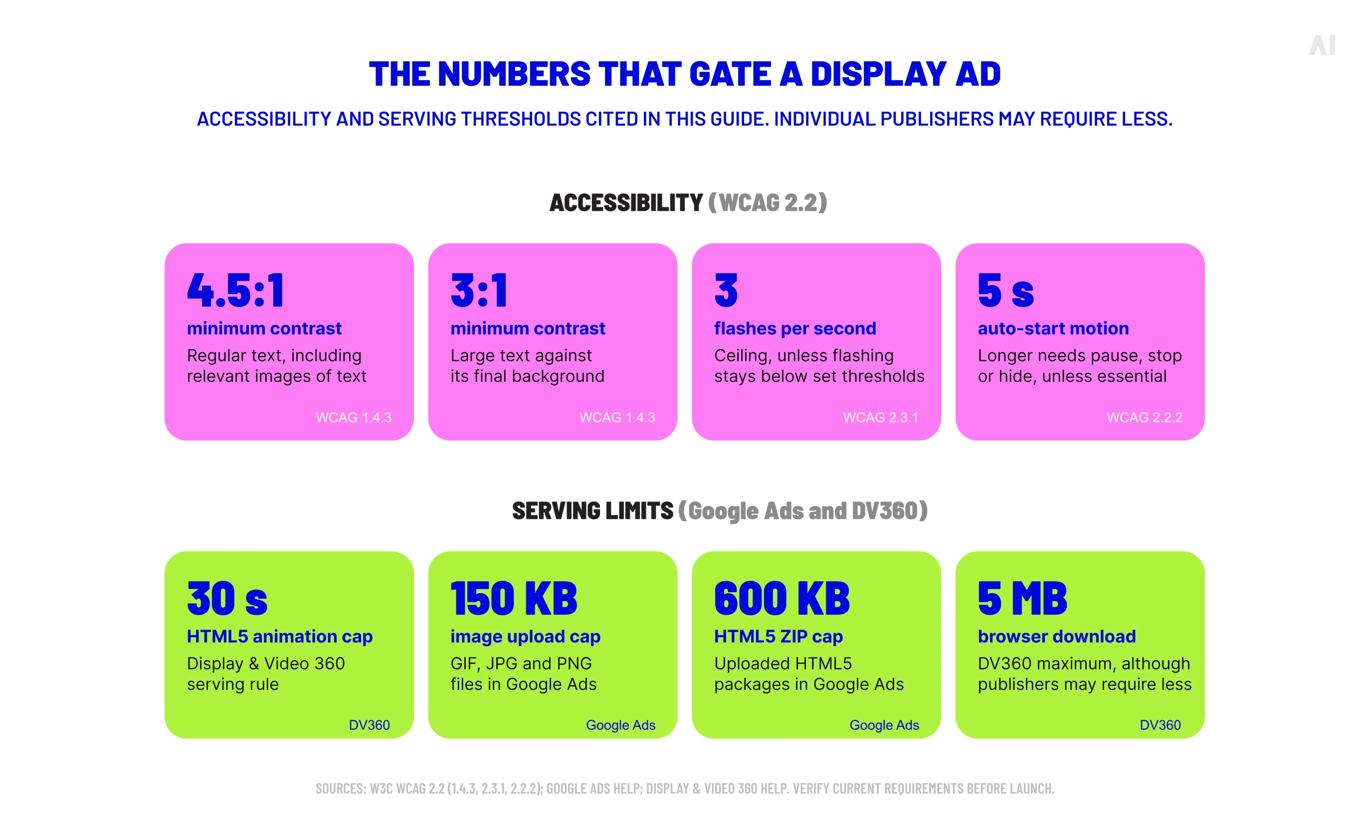
Serving rules vary. Display & Video 360 limits HTML5 animation to 30 seconds, while accessibility needs a separate review. WCAG 2.2 restricts flashing above three times per second unless it stays below defined thresholds.
💡 Review the flashing guidance.
Auto-starting movement that lasts more than five seconds beside other content also needs a pause, stop or hide control unless essential.
Responsive asset-based display ads
Responsive display ads replace one locked composition with separate headlines, descriptions, images and logos. Google's format requires horizontal 1.91:1 and square 1:1 imagery, so each visual must remain useful under different crops.
💡 See Google's responsive display ad specifications.
Every asset must work independently. Images cannot depend on text baked into one corner, logos need clear space and text combinations must avoid repetition.
Responsive systems combine supplied assets to fit placements. Dynamic creative can select or alter content through data, feeds or rules. HTML5 may support either approach, but it does not make every unit dynamic.
The core elements of a display ad
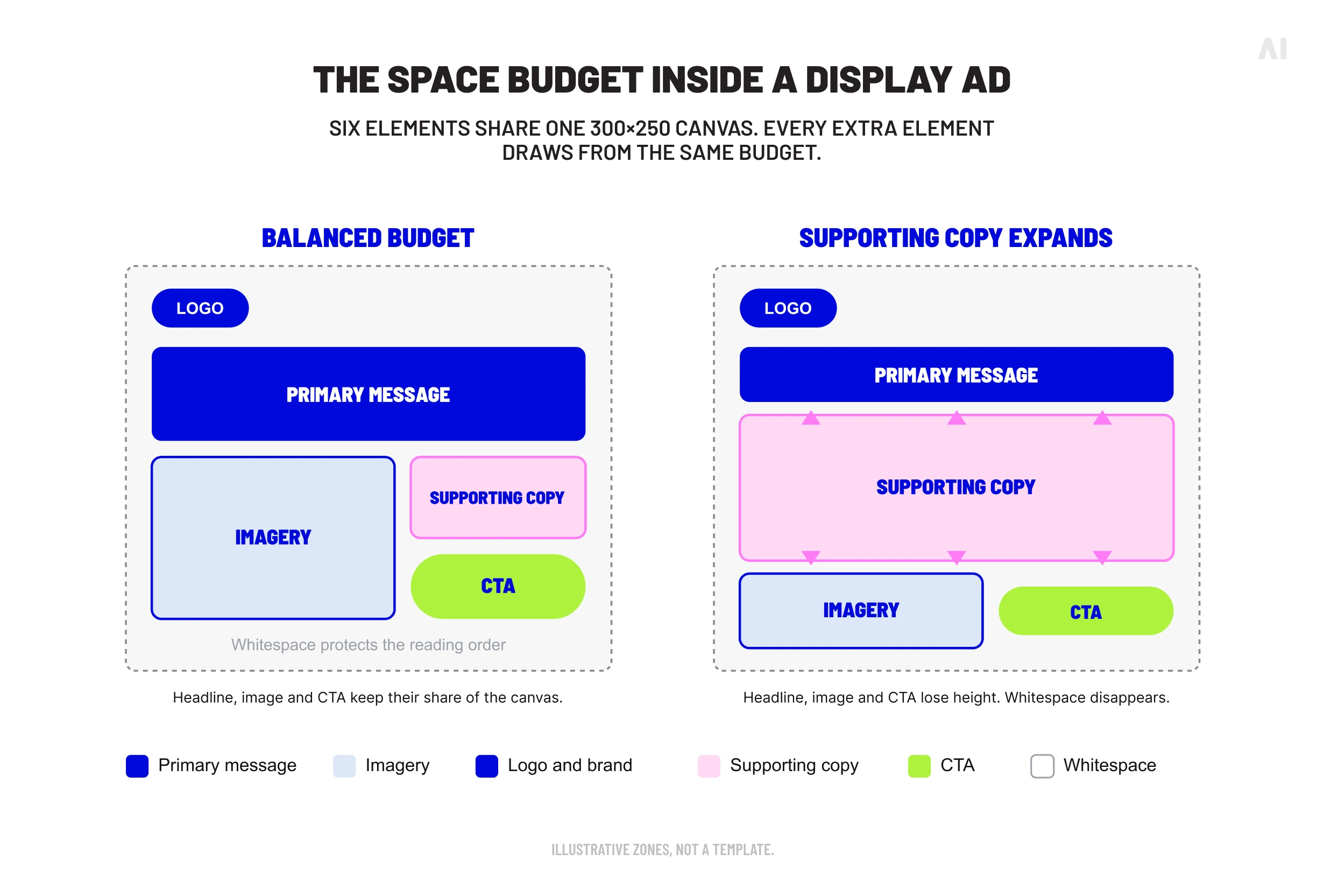
Every placement creates a limited space budget shared by six elements:
- Primary message: The main idea, benefit or offer the viewer should retain.
- Imagery: The product, person or visual device that carries attention and recognition.
- Logo and brand elements: The identifiers connecting the message to the advertiser.
- Supporting copy: Additional context used only where space allows.
- CTA: The intended action, expressed clearly and placed where it can be found quickly.
- Whitespace: Unoccupied area that protects the hierarchy.
Priority should be assigned before these components enter multiple units. Secondary copy can disappear in a compact placement; the brand and primary message usually cannot.
⚡ Every extra element spends space that the main message may need.
How to adapt one display ad concept across multiple sizes
Creative adaptation defines what makes the campaign recognizable, then rebuilds the hierarchy for each placement. Proportional resizing preserves coordinates but often makes type, logos and controls too small.
Start with the core message and visual idea
Before opening templates, divide the concept into essential and optional components. Keep four essentials:
- The primary message or offer
- The focal product or visual idea
- The minimum brand identifier
- The intended action
Supporting claims, secondary imagery and decoration are optional. This division lets reviewers approve the concept, then check that each execution preserves its meaning without demanding identical coordinates.
Rebuild the hierarchy for each aspect ratio
Horizontal, rectangular, vertical and compact placements require different routes through the composition.
Automation can create canvases and suggest positions. A human still needs to review the final hierarchy at delivered dimensions.
Protect readability in the smallest formats
The smallest placement is a stress test for the display creative system. View it at actual size and check the headline, image, CTA, logo and surrounding space.
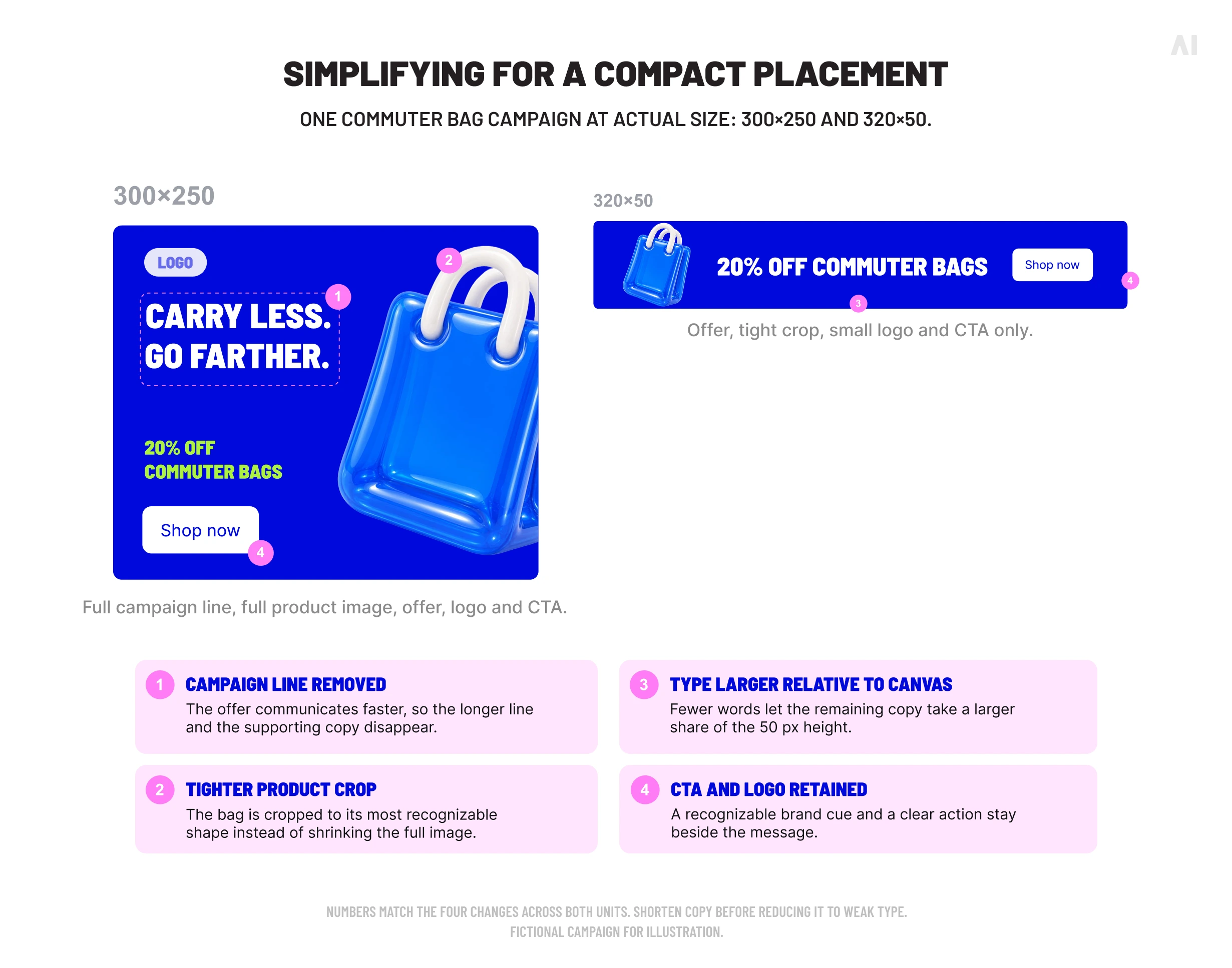
Shorten copy before reducing it to weak type. If a narrow crop loses its subject, use a dedicated asset. Larger versions may also benefit from the resulting restraint.
⚡ The smallest unit reveals which parts of the concept are essential.
Creative rules that must survive across display formats
Layouts can change substantially, but several rules should remain stable throughout the asset family:
- Keep one dominant message. Supporting information remains subordinate.
- Maintain readable typography. Judge type at delivered size against its final background.
- Retain recognizable branding and action. Keep the logo and CTA clear without letting either dominate.
- Preserve useful spacing. Crowding obscures the reading order, especially in compact units.
- Protect contrast. WCAG 2.2 specifies a minimum contrast ratio of 4.5:1 for regular text and 3:1 for large text, including relevant images of text.
💡 Read the W3C contrast guidance.
- Reduce secondary content as space decreases. Remove decoration or supporting copy before shrinking every component.
These rules create consistency through recognizable priorities.
Display ad design mistakes that hurt usability or approval
Common production failures include:
- Shrinking the master composition: Type, logos and CTAs become unusable.
- Keeping the same copy everywhere: Compact placements become crowded.
- Using one crop for every ratio: The subject disappears or leaves unusable space.
- Allowing weak contrast: Text fails at delivered size or over a detailed image.
- Adding motion without a reading plan: Transitions receive more attention than the message.
- Changing brand treatment: Inconsistent logos, colors or type weaken recognition.
- Imitating interface controls: Fake warnings, deceptive icons and unclear buttons can mislead users and create approval problems.
Google's misleading ad design policy prohibits ads resembling system warnings, dialog boxes or surrounding content, along with non-functional controls and standalone buttons without context. Other platforms and publishers apply their own policies.
Display ad production and QA before launch
A reliable QA process separates visual review from technical validation.
Creative QA should confirm:
- The hierarchy remains clear and image crops preserve the subject.
- Headlines, supporting copy, logos and CTAs remain legible at delivered size.
- Contrast, motion and flashing have been reviewed for accessibility.
- The offer, branding and action remain consistent across versions.
- The final frame of an animated unit remains visible long enough to read.
Technical validation should confirm:
- Dimensions and aspect ratios match the planned inventory.
- File type, weight and animation meet the serving requirements.
- HTML5 assets load without missing dependencies.
- Click-through behavior and destination URLs work as intended.
- Backup assets are present where required.
- Every variation passes its current platform checks.
File limits demonstrate why the destination must be known early. Google Ads caps uploaded GIF, JPG and PNG files at 150 KB and HTML5 ZIP files at 600 KB. DV360 permits up to 5 MB downloaded by the browser, although publishers may require less.
A passed validator confirms technical compatibility, not message clarity, crop quality or mobile readability. Final review needs both production expertise and a viewer's perspective.
⚡ Technical acceptance confirms that a file can run. Creative QA determines whether it should.
Display ad design examples: What to look for
These current-format examples use one fictional commuter-bag campaign. Its core idea is “Carry less. Go farther,” supported by a product image, offer and “Shop now” CTA.
A compact placement that requires simplification
The larger version accommodates the campaign line, full product image, offer, logo and CTA. The mobile banner changes the message to “20% off commuter bags,” uses a tight product crop and retains a small logo beside the CTA. The longer line disappears because the offer communicates faster.
One creative idea adapted across sizes
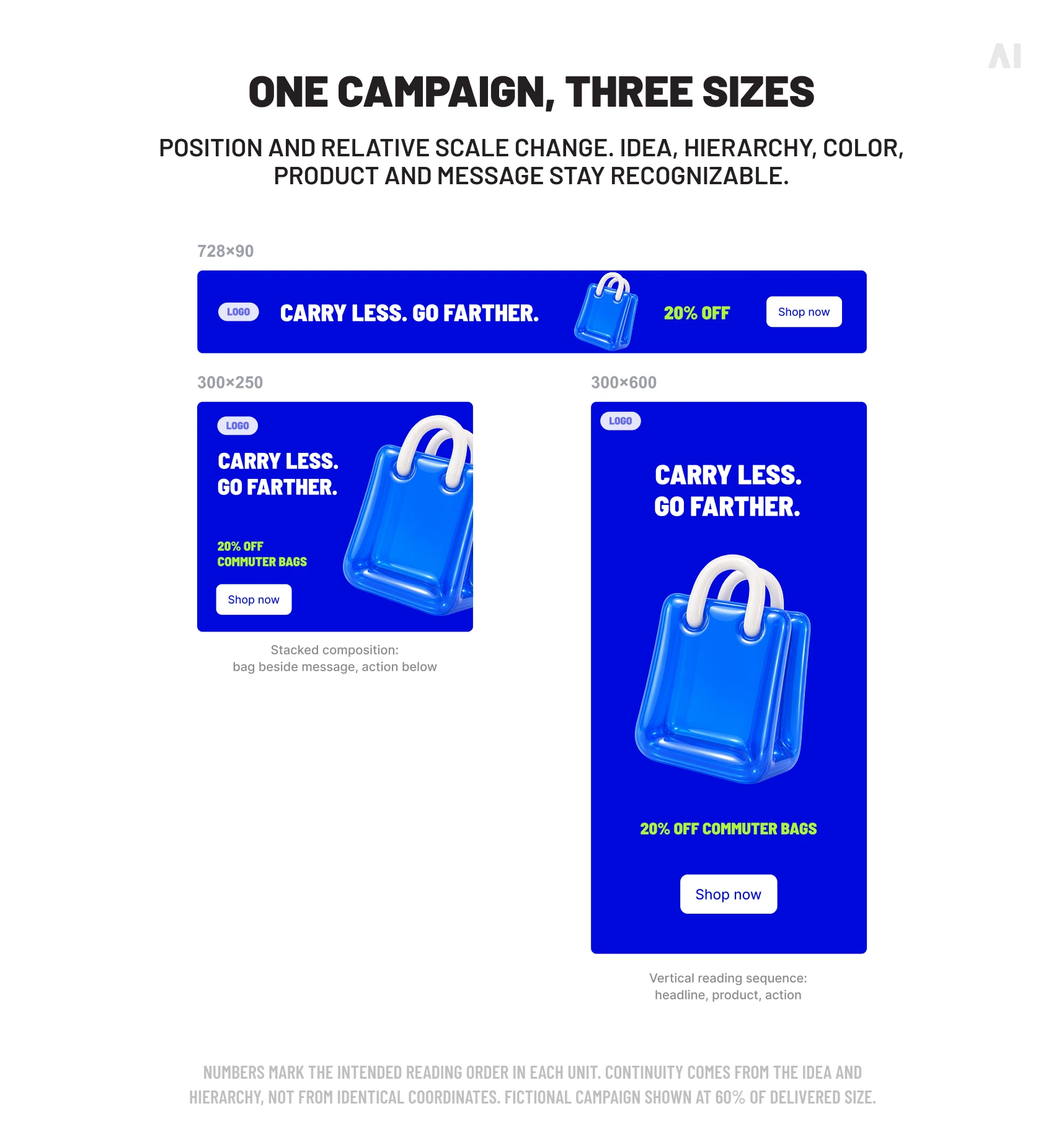
The leaderboard uses one horizontal sequence: logo, headline, product and CTA. The medium rectangle stacks the bag beside the message. The half-page version places the headline first, lets the product dominate the center and ends with the action.
Color, product, typography and message remain recognizable while position and relative scale change. Continuity comes from the idea and hierarchy.
Motion used to sequence information
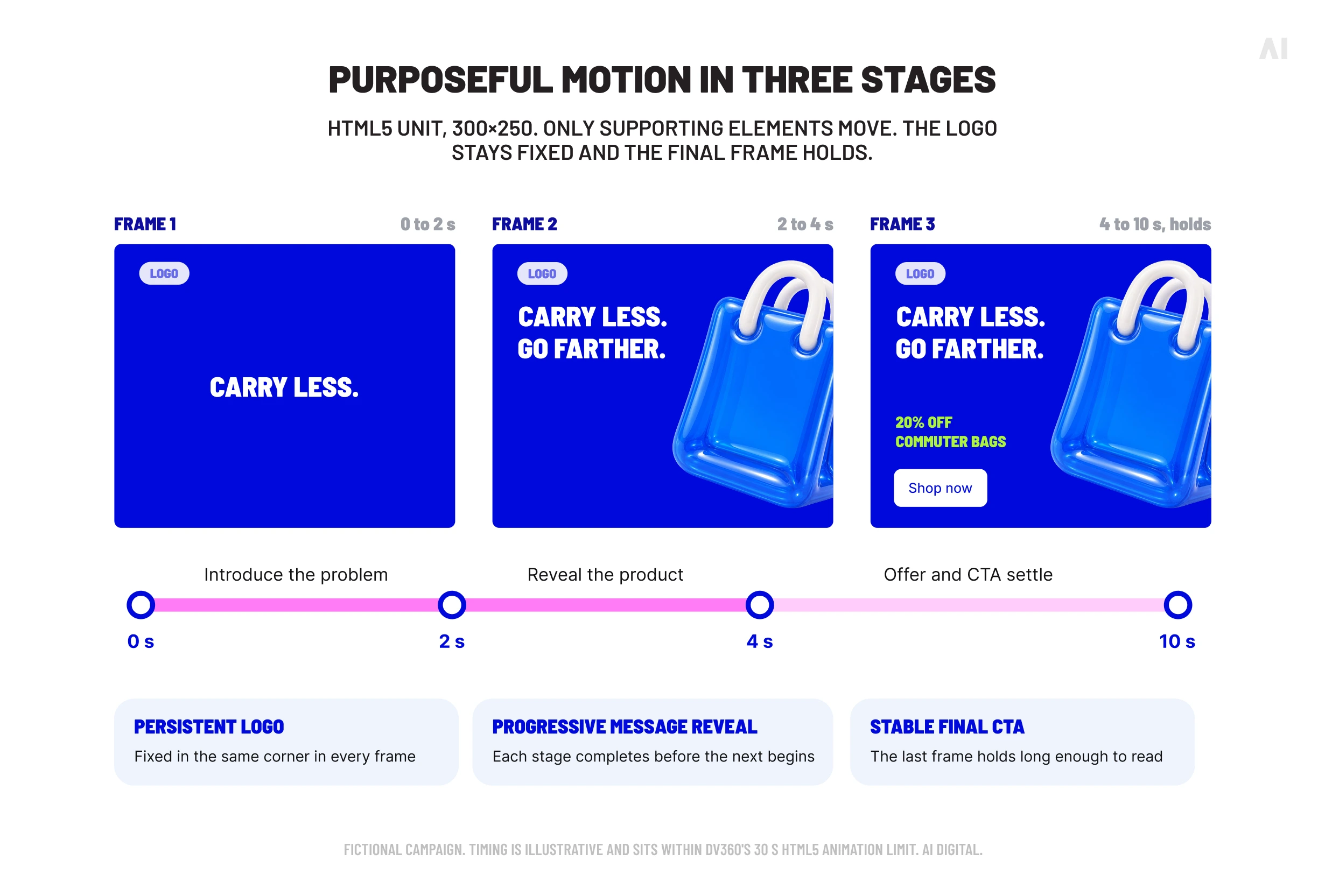
An HTML5 version divides the campaign into three stages. The first introduces “Carry less.” The next reveals the bag and completes “Go farther.” The final frame presents the offer and CTA with the logo still visible.
Only supporting elements move. The logo remains stable and the final frame settles long enough to read, distributing information that would compete inside one frame.
How AI Digital helps scale display creative production
One approved concept can quickly become dozens of deliverables, from static and HTML5 creative to multiple dimensions, platform-specific versions and localised variants. AI Digital’s AI Creative Studio helps teams manage that production load without losing the clarity or consistency of the original idea.
AI-assisted workflows accelerate aspect-ratio resizing, format adaptation and multi-platform versioning, while experienced creative specialists oversee hierarchy, brand discipline and final quality. The result is a faster, more reliable route from one campaign concept to a complete set of placement-ready display assets.
Build display ads that work across every placement
Effective display ad design combines a clear concept with format-aware execution. Teams preserve the message and brand while rebuilding the composition and checking each file against its serving conditions.
If you want to extend an approved campaign idea into clear, accessible and placement-ready display creative at scale, talk to AI Digital about the formats and production support your campaign requires.